
IMPACT
2 h → under 10 min
Quote turnaround
30% faster product
search
40% fewer errors
Primary focus
Partners were spending too much time manually creating quotes.
Before the redesign:
Quotes were built using spreadsheets, PDFs, and emails.
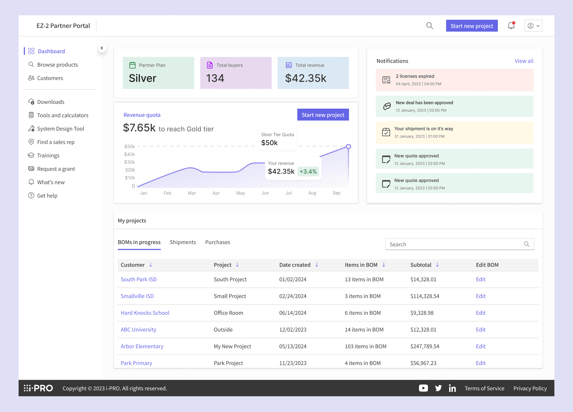
Integrators lacked a single place to view their tier status, revenue, and quota updates, making it difficult to track progress at a glance
Accessory lookup required switching between catalogs and sites.
Outdated pricing and inventory led to frequent support calls.
Design goals:
Centralized data: One unified hub for catalogs, pricing, and inventory.
Incentivized growth: Live tier-tracking to drive higher spend and loyalty.
Automated quoting: Instant, error-free quote generation without manual entry.
Live updates: Real-time updates for 100% pricing and stock accuracy.
"I have no way of keeping track of things."
Quote from user interviews
Design approach
Design approach
To kick off the redesign, our first step was mapping out how partners actually manage quotes with the old system.
Mapped partner workflows:
Tracked every step partners took to manage quotes
Identified pain points where manual effort caused delays and errors.
Top pain points:
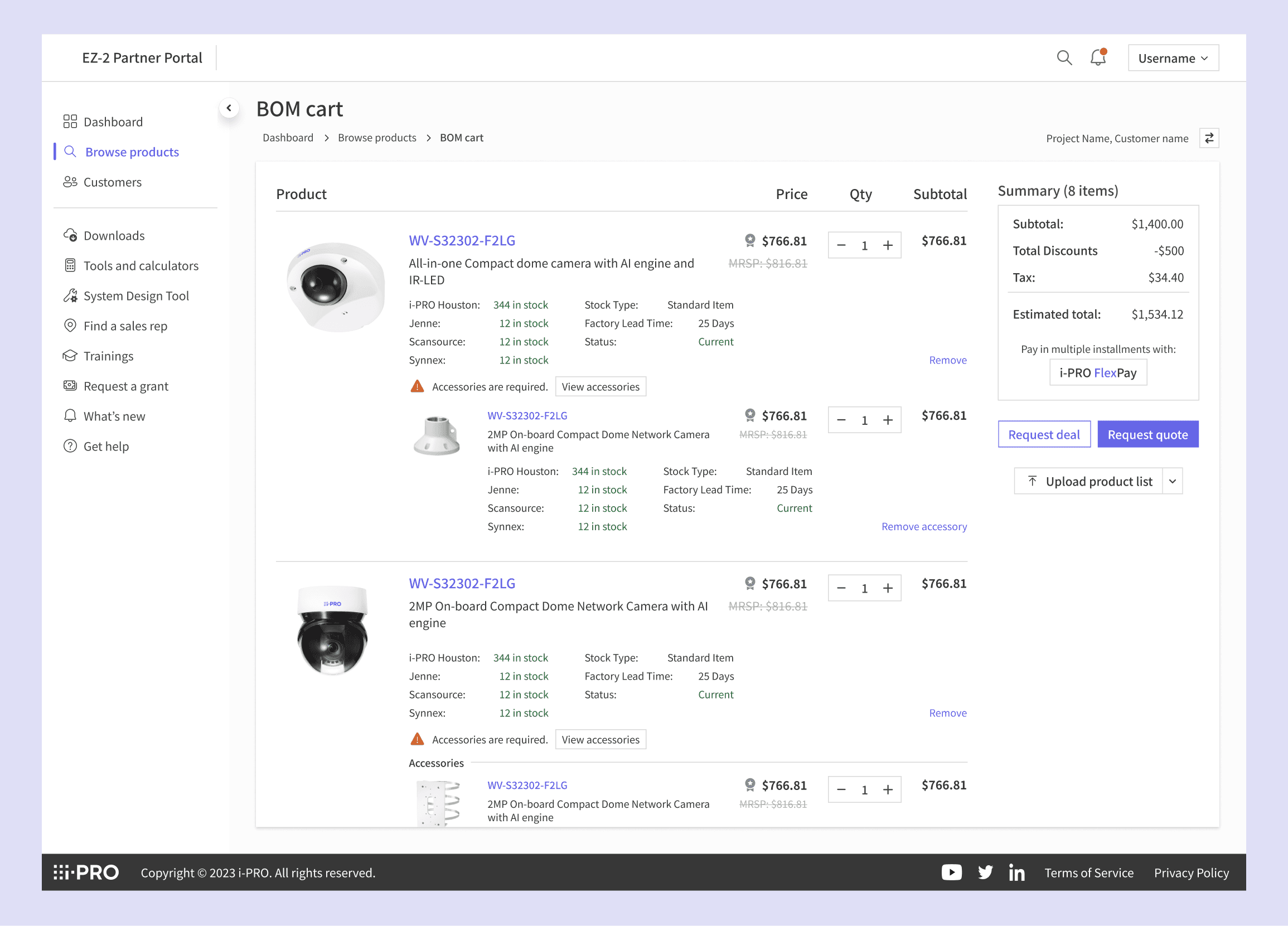
Reliance on External Sites
Partners must leave the core platform to gather product, pricing, or inventory data before building quotes.
Switching between external systems introduces delays and raises the chance of data entry mistakes.
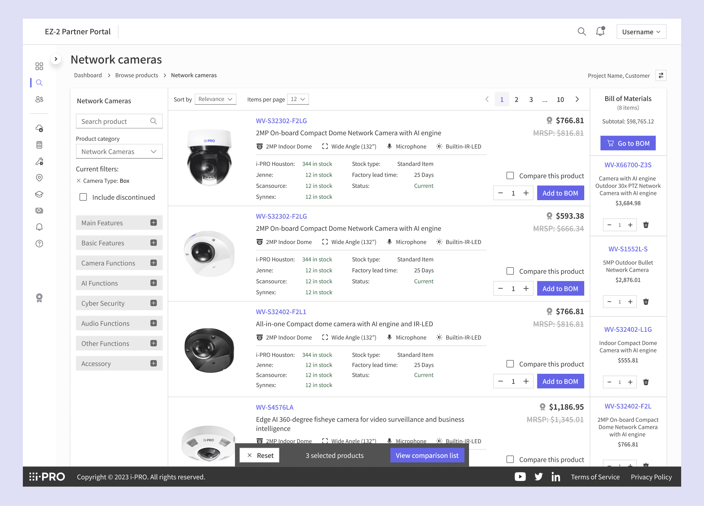
Search Difficulties Within the Platform
The current search functionality is not robust, so partners struggle to quickly locate relevant products and pricing.
Static Dashboard
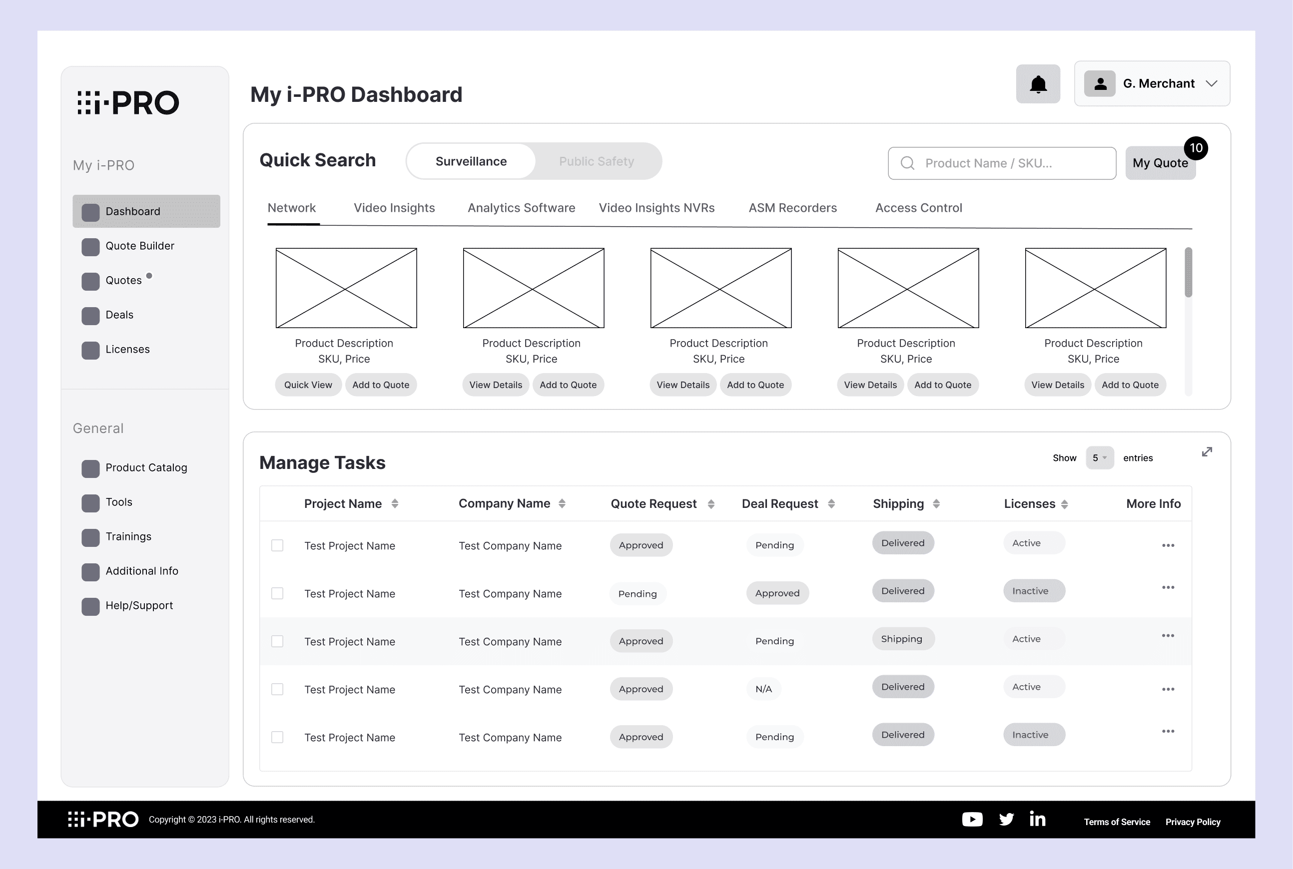
Partners lack visibility into quote progression, outstanding approvals, and upcoming deadlines, leading to lost opportunities and uncertainty. When partners encounter roadblocks or unclear steps, support channels are slow.

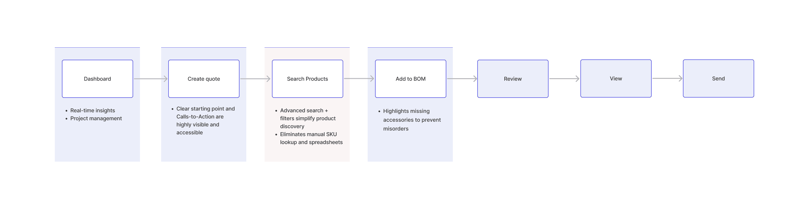
Workflow
Workflow walkthrough
Concepts
Concept 1 worked better because it provided a clear, data-driven view of revenue, tier progress, and shipments in one place. This improved visibility and efficiency, helping users track goals and performance more effectively

User testing
Key change from user testing
User testing revealed that while the new design was intuitive overall, two key improvements were needed:
Tabbed navigation for project updates:
Users prefer having project management visible on the dashboard above the fold to avoid excessive scrolling. To enhance discoverability and navigation, project updates were reorganized into three dedicated tabs, allowing users to quickly switch between sections without scrolling back and forth.
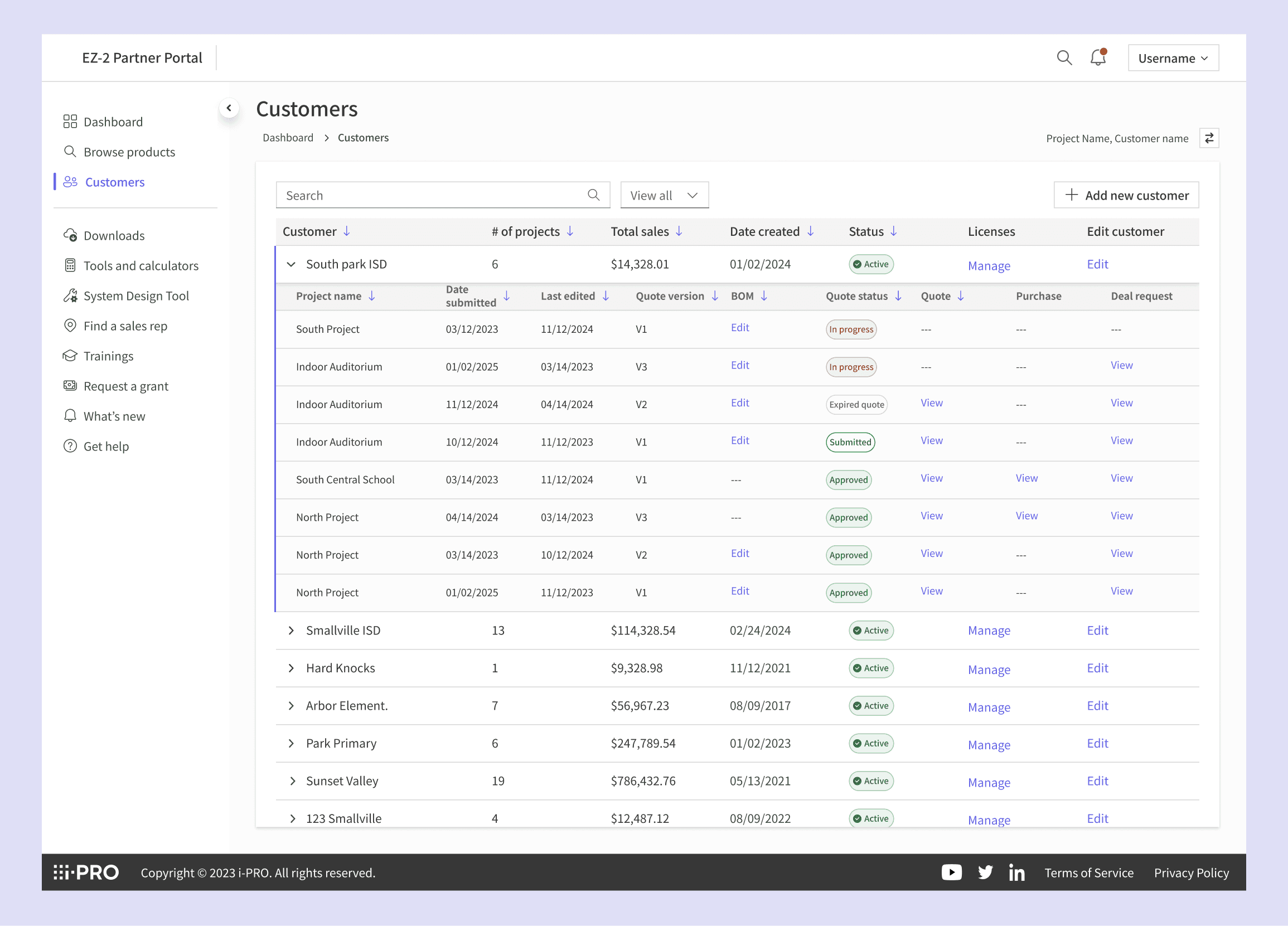
Sorting projects by customer:
Partners manage multiple projects per client, so sorting by customer rather than by project created a clearer, more efficient workflow, making it easier for users to view and manage all related activities for each customer in one place.
Impact
Impact
Led design of instant quoting system. Cut quote turnaround from 2 hours to under 10 minutes
Reduced product search time by 30%
Introduced real-time pricing and inventory sync across the portal, ensuring 100% data accuracy and cutting order errors by 40%.